Evolving Groupon’s Design Language
How a self-initiated audit turned into a visual overhaul and a WCAG-compliant color token system.
Company
Groupon
Industry
Ecommerce
My Role
Product Design
my Role
Web & Mobile
Year
2016
I led "Project Clarity," a bottom-up initiative to modernize Groupon’s aging design system. By introducing semantic color tokens, consolidating typography, and auditing accessibility, I transitioned the app from a "brand-heavy" aesthetic to a "content-first" experience. The result: A 100% accessible UI that maintained conversion parity while drastically reducing engineering debt.
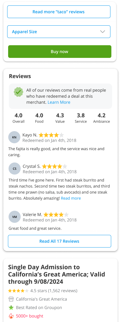
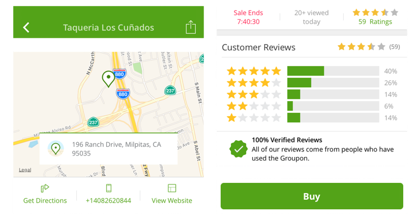
Green Everywhere
An Aging Aesthetic & Accessibility Issues
While Groupon’s product had evolved, our visual language remained stagnant. I initiated an audit that revealed critical systemic issues:
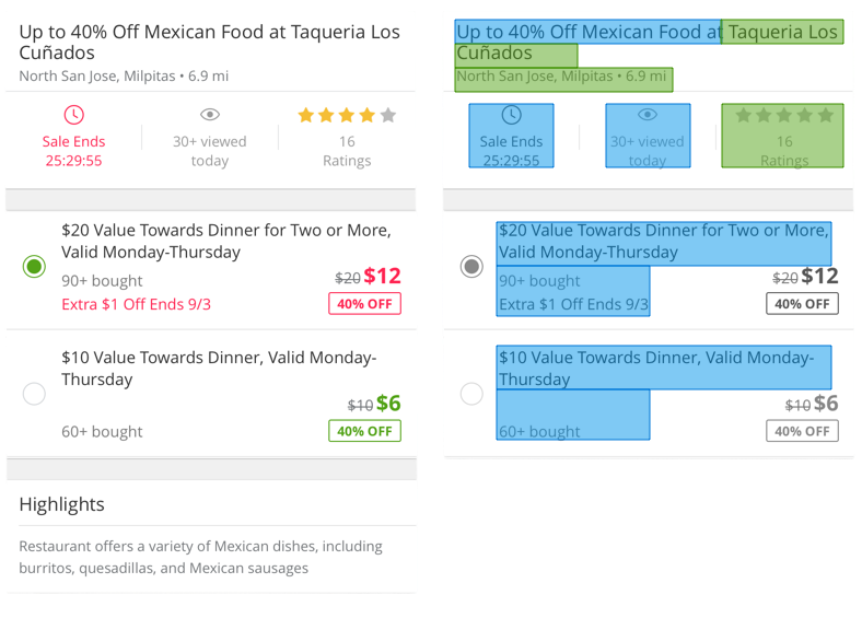
- WCAG 2.0 Contrast Accessibility Failures: Our core brand green failed WCAG 2.0 contrast ratios (3.17:1), posing a legal and usability risk.
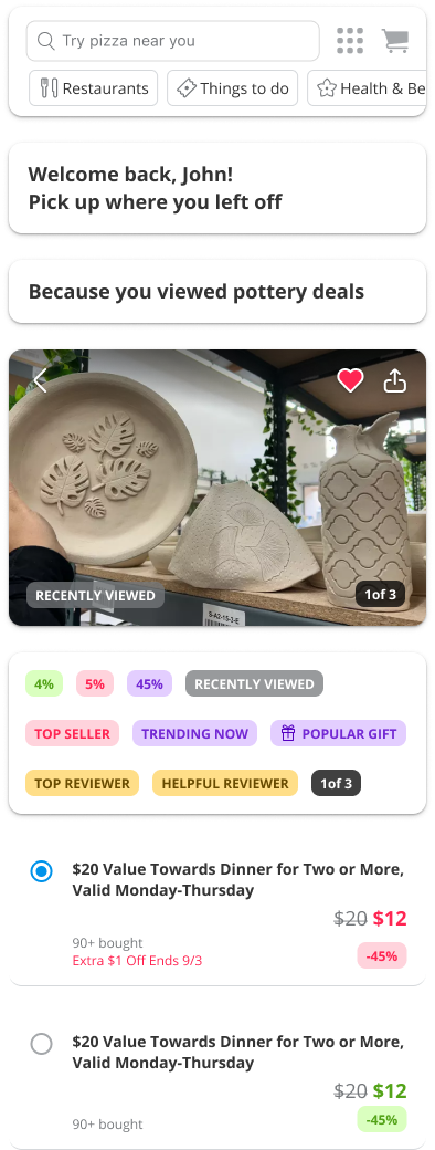
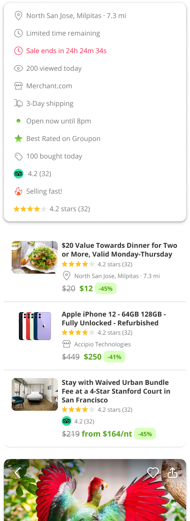
- Visual Noise: Overuse of brand colors distracted users from the actual value—the deals.
- System Inconsistency: LivingSocial and Groupon shared a codebase but lacked a unified token structure, making cross-platform updates a manual nightmare.
Color with intention
Color Tokens and Components
I moved us away from hard-coded hex values toward a semantic color token system. This allowed us to support both Groupon and LivingSocial brands from a single source of truth.
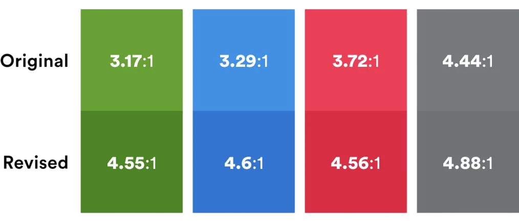
- WCAG 2.0 Accessibility: Defined "Primary Green" to a shade that passed AAA contrast for small text.
- Type Consolidation: Collapsed dozens of disparate styles into a streamlined system of three sizes (14pt, 16pt, 20pt) across three weights, documented via Zeplin (Remember Zeplin?) for developer handoff.
- Consistent margins, padding, and rounded corner values.
Getting a "Side Project" on the Roadmap
Since this wasn't an official project, I had to prove its value without disrupting engineering or product.The Testing Ground: I chose the Deal Page for the pilot—it’s the most component-dense page and a high-stakes conversion driver.
The "Flat is a Win" Strategy: Visual redesigns often risk "re-learning" friction for users. I pitched that if conversion stayed flat (neutral), the system was a success because it lowered technical debt and improved accessibility.
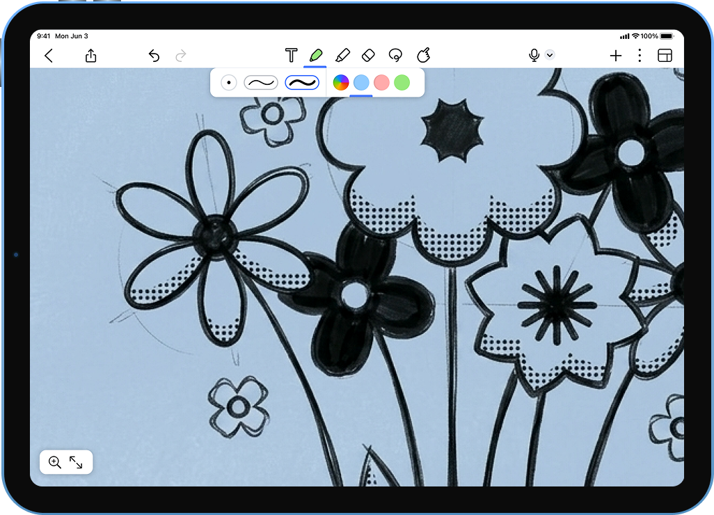
Refining Model B: Favorite tools
We saw a flood of customers who favored Model B:
“I love love love the new favorite tools feature, it’s so much easier and faster to change between pens, erasers and highlighter.”
“I love the new side panel for favourite highlighters and pens. A feature I hadn’t thought I needed. Makes reading and highlighting with different colours much simpler.” (from a customer in the UK, if you couldn’t tell)
“The addition of the different pens is great, i love it. Will you be adding different types of pens, too. I love the improvements it makes it easier to take notes and is far more efficient”
To address ergonomic feedback, I evolved the toolbar from a fixed component into a movable, resizable utility. By supporting edge-anchoring and variable widths in the MVP, we solved for a wide range of accessibility needs and individual note-taking styles without cluttering the core experience."
Completion Time
Measuring the decrease in founder "Back-tracking"
Aiming to reduce the founder time typically lost to "Legal Back-and-Forth".